We’ve already talked briefly about trends, and how – in order to consider investing in a particular sector - we need to see four consecutive weeks of consistent data. (See The two indicators for moving your money: a significant trend, and out-performance).
But it’s also useful to look at a couple of other time periods: 12 weeks, and 26 weeks.
Just to reiterate, four weeks is the key period that we consider. Our primary decision-making comes from the 4-week numbers.
Having said that, if we’ve identified a 4-week trend and we see that it also has a positive 12-week trend, this is nice confirmation of the 4-week trend. It’s not essential that the 12-week trend is also present, but it gives added weight to the significance of the trend.
Finally, the 26-week trend – if it’s present – is even further confirmation that the 4-
week trend is part of a longer-term movement. It’s not often that we see a 26-week
trend in one particular sector, but when we do it’s a real money-making opportunity.
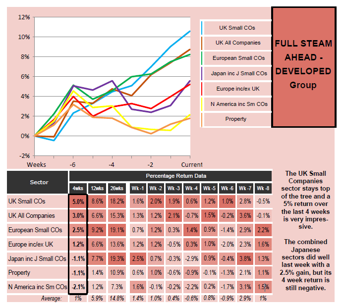
For example, here’s an example of weekly data for the Full Steam Ahead Developed group, from May 2015.
Look at the performance of the top sector - UK Small Companies:

As you can see, the 4-week data is the first column of the table, outlined in black. UK Small Companies are way out ahead of the other sectors, with a 5% return over the last 4 weeks.
Then look to the next two columns to the right: 12 weeks and 26 weeks. Here you can see that the positive trend is confirmed – with a 12 week return of 8.6%, and a 26 week return of 18.2%.
Admittedly with the 12-week and 26-week returns there are other sectors in the top position. If you look down the 12-week column, you’ll see that European Small Companies have outperformed UK Small Companies over this period, with a 9.2% return. And over 26 weeks Japan incl. Japanese Small Companies has the highest gain, with 19.3%.
This is where some people may want to take slightly different approaches.
If you prefer to stick to trends which have been established over longer time periods (12 weeks or 26 weeks), then you might choose to invest in the European Small Companies or the Japanese Small Companies sector.
But if you’re happy investing in trends that have emerged over a shorter time period (4 weeks), then you’d invest in the UK Small Companies sector – as that’s the largest return over the most recent 4-week period.
From our perspective, the key period is 4 weeks (which is why it’s outlined in black), and it’s clear from this table that UK Small Companies are way out in front. The 12-week and 26-week numbers just serve to confirm the positive trend over longer periods – giving us extra confidence that this is a good sector to invest in.
There are also other situations where the 12-week and 26-week data is useful.
One is when you are wondering whether to stay in a sector. For example, you may be invested in the UK Small Companies sector and then one week you see, from the 4 - week data, that the Japan incl. Japan Small Companies sector has jumped ahead of it. Do you immediately sell your UK Small Companies fund and buy a Japanese fund?
Not necessarily. If the sector you’re already invested in has got a stronger performance over 12 and/or 26 weeks, then it’s best to stick with the one you’ve got.
Also when it comes to choosing between different funds in a sector – if you’re trying to decide between two funds with similar short -term (4-week) performance, then if one of the funds has a better longer-term trend over 12 or 26 weeks, that would tip the balance.
There are two other pieces of information from the Saltydog data that can help you ascertain trends. These are the week-by-week numbers over the last eight weeks, and the corresponding 8-week chart.
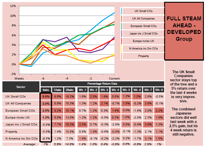
Let’s take the same example of weekly data that we just looked at:

The last eight weeks’ numbers are on the right of the table, after the 4-week, 12 -week and 26-week numbers. They are presented in reverse chronological order, with the most recent week’s performance, “Wk -1”, coming first, all the way down to Wk - 8.
What these weekly numbers enable to us to do is see how strongly a trend is performing, and whether new trends are emerging. The corresponding chart gives a more visual representation of the same data.
For example, in the data above we can see that UK Small Companies have had a positive gain in seven out of the past eight weeks. It’s only the Wk -8 figure that is negative. So that is a very strong trend. Obviously you can also see that visually from the chart, where the light blue line representing UK Small Companies is soaring upwards.
But what we can also see from the weekly data is Japan incl. Japan Small Companies is the best-performing sector in the past week (Wk -1), with a 2.5% gain, compared with the 1.6% gain for UK Small Companies.
Although we certainly wouldn’t be investing in the Japanese sector this week – as it’s the 4-week data that’s crucial, and over four weeks this sector is showing a negative return of -1.1%. However the strong movement over the last week gives us something to look out for over the next few weeks, to see whether a new trend is starting to emerge.
Another factor you can see from the chart is the relative volatility of the different trends. If you want to avoid fluctuations in your investments, then you want to choose the nice, smooth, upward-moving trends, rather than more ‘choppy’ ones. If you can live with the volatility, it doesn’t matter so much.
In the chart above we can see that not only are UK Small Companies (light blue line) out-performing all the other sectors, but that this sector also has the smoothest upward trend.
Read next > The final investment decision: picking funds

Comments
0 comments
Please sign in to leave a comment.