Take a look at this. It’s a chart of the FTSE All Share index over four years from 1999 - 2003.
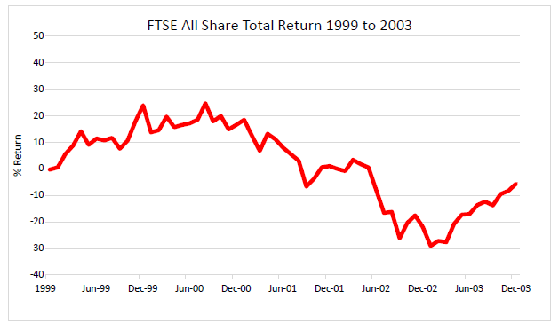
Using this chart as a baseline, let’s see how some of the low volatility sectors compare with it.
Here’s the same chart of the FTSE All Share again (in red), but this time with the performance of various low volatility sectors superimposed on it.
The crucial thing to notice is the relationship between the FTSE All Share (red line), and the low volatility sectors.
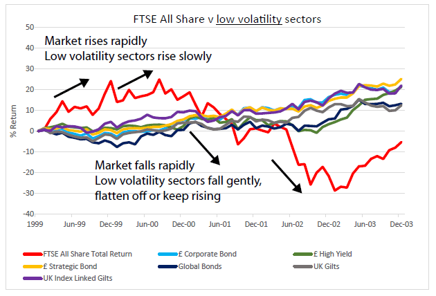
As you can see, when the All Share (red line) rises rapidly in the first third of the chart, the low volatility sectors also rise, but much more slowly and gently.
And in the second third of the chart, when the FTSE All Share (red line) drops sharply, some of the low volatility sectors also drop down – e.g. the green line – but not very much. The other low volatility sectors simply flatten off, or even keep gently rising.
This is a graphic illustration of what “low volatility” means. The ups and downs are less. Compared with the overall market (red line), the low volatility sectors move in a much smoother, more dependable trajectory. For us, as investors, that means if we’re invested in these sectors we can sleep more soundly.
Now let’s have a look some sectors that are more volatile.
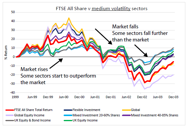
Here you can see a quite different situation.
As the FTSE All Share (red line) moves up, all these sectors are moving up much more strongly, compared with the first chart above.
In fact some of these sectors are out -performing the market. The top 4 lines – yellow, pink, blue and purple – are actually above the rising red line, during the up-trend. This didn’t happen with any of the sectors in the first chart.
Similarly, when we come to the second third of the chart, as the market (red line) drops down, all the sectors also move down sharply – particularly the pink line, which has now clearly done worse than the market.
Compared with the flatter lines of the sectors in the first chart, there’s a lot more movement here – in both directions, up and down. This is what higher volatility looks like.
Now, to complete our understanding, let’s go one stage further and look at the most volatile sectors of the market – the high volatility ones.
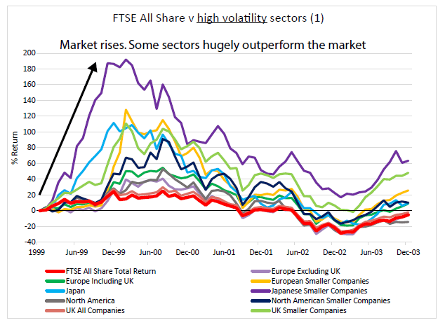
As you can see, this time round the effect is even more pronounced.
(N.B. The red line looks slightly flatter in this chart because the scale has been altered to accommodate the much bigger movements of some of the sectors).
As the FTSE All Share (red line) moves upwards, you can see that some of the high volatility sectors really rocket up into the stratosphere. Compared to what looks like a sedate, plodding All Share, they’re on steroids.
As the FTSE All Share moves up from 0 to around 20, the best-performing sector (in this case, the purple line - Japanese Smaller Companies) has gone from 0 to 180. Nine times higher!
Similarly, an exaggerated movement also happens on the way down – though in this particular instance it’s not nearly as dramatic as the upward movement.
To make it easier to see, here’s a chart from the beginning of the downward trend, starting in August 2000, with all the sectors rebased to start from zero.
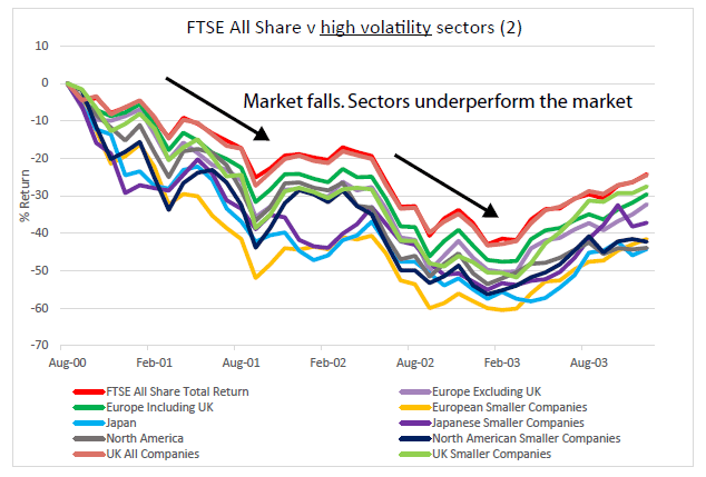
As you can see, the FTSE All Share (red line) drops about 42%.
At the same time almost all the high volatility sectors exaggerate this downward movement. And one of them, European Smaller Companies (yellow line) drops by 60% - nearly one and a half times more.
Of course this is not of the same magnitude as the upward movement, where Japanese Smaller Companies beat the market by nine times.
But that’s just what happened on this occasion. In general, the high volatility sectors are just as likely to dramatically amplify downward movements too.
The principle remains the same:
Low volatility sectors dampen the market movement, both up and down. High volatility sectors exaggerate the market movement.
Now that you’ve seen the charts, I can explain the practical conclusions we can draw from these patterns
– and how they can help us make more money from our investments, with less risk.
Sector volatility: the 10-year proof
In case you’re wondering, our conclusions about sector volatility aren’t based on 4-year charts.
When we first thought about launching the Saltydog system, we did extensive research into the volatility of the 33 different sectors.
We plotted every sector’s weekly returns and calculated their standard deviation in detail over a 10-year period. That means that we can prove mathematically that certain sectors tend to move in similar ways, and have certain consistent levels of volatility.
Read next > How to use volatility to maximise gains & minimise losses

Comments
0 comments
Please sign in to leave a comment.