Since the market is moving around all the time, the critical question is:
How do we know when to make a move? – i.e. when to shift our money into the sectors that will perform best?
There are two key indicators:
- We need to see a significant trend in a sector, and
- We need to see that this particular sector is significantly out-performing other sectors.
As regards the first point – obviously we can’t be reacting to every little move in the market. We are active investors, but we aren’t day traders. So we need a way of filtering out the ‘noise’ – all the smaller ups and downs – and focussing only on the significant trends.
From all our research and years of experience using the Saltydog system, we have established that a significant trend consists of 4 consecutive weeks of consistent data.
Anything less than four weeks’ worth of data isn’t enough to reveal a trend. With our research we analysed the trend patterns from many different time periods, and four weeks was the most significant.
One proviso: a four-week trend is no guarantee that a positive move will continue. A market trend that’s been running for four weeks could easily fizzle out in week five.
But four weeks is the best starting point for us… and, most importantly, it has been proven to work – as the results of our demonstration portfolio have shown, significantly beating the FTSE 100 over the past five years.
So four weeks is the key time-period we use for deciding whether a trend is a trend.
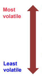
As regards the second point, the principle here is: you never invest in a more volatile sector, unless it’s showing significant out-performance compared to the less volatile sectors.
This is a crucial aspect of the Saltydog approach to risk management.
To put it very simply: Why take on extra risk unless you’re getting something worthwhile in return?
The more volatile sectors definitely offer the prospect of bigger gains, when the market is heading up. But they’re also riskier. You can lose a lot more money in the more volatile sectors too, when the market situation changes. So you only move into them when they are clearly worth it.
(And, as I mentioned earlier, the extent to which you increase your exposure to more volatile sectors is entirely up to you – depending upon the level of risk you want to take. We’ll come back to this in more detail later. See Cautious or adventurous? Deciding how much risk you want to take ).
Here’s what you do:
- You look at the four-week performance of the sectors in the various groups: Slow Ahead, Steady As She Goes, Full Steam Ahead (Developed Markets) and Full Steam Ahead (Emerging Markets).
- You ask yourself: Are the returns from the sectors in the Steady As She Goes and Full Steam Ahead groups (higher volatility) significantly better than those from the Slow Ahead group (lower volatility)?
- If the answer is No, then you should simply stick with sectors in the Slow Ahead group.
- And if the answer is Yes, then you can consider investing in sectors in the Steady As She Goes or Full Steam Ahead groups.
A simple example (no. 1)
Let’s look at a simple example, using the Saltydog data from one week in May 2014 :
First, if we look at the top three Saltydog groups in the chart below, we can see that the most volatile group – Full Steam Ahead, Emerging Markets (light blue line) is performing worse than Full Steam Ahead, Developed Markets (orange line) and Steady As She Goes (purple line).
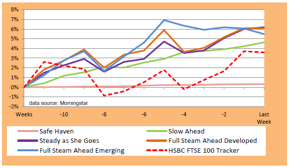
And particularly over the last 4 weeks (look at the 4-week mark on the bottom axis), Full Steam Ahead, Emerging Markets (blue) has dropped, whereas Full Steam Ahead Developed (orange) and Steady As She Goes (purple) have gone up.
So in this scenario, why would we invest in Full Steam Ahead, Emerging Markets? We wouldn’t. It’s a more volatile group, it’s more risky, and it’s underperforming.
We can get actually get a better return from less risky groups, so there’s absolutely no point in investing in the most risky group (Full Steam Ahead, Emerging).
To look at this in more detail, let’s consider the fund sectors within these groups.
Here are the Saltydog numbers for the top sectors in these three groups. (Listed in order of volatility, with the least volatile at the bottom).
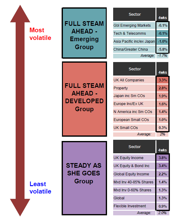
If you look at the bottom figure in each column – the Average for each group – you can see that they simply reflect what’s shown on the chart. Over the last four weeks, FSA Emerging has gone down -1.7%, whilst FSA Developed and Steady As She Goes have both gone up 2%.
But what’s also key is the highest-performing sector. As you can see, over the last four weeks the highest return is 3.8% from the UK Equity Income sector. And which group is this sector in? It’s in Steady As She Goes, which is the least volatile group of the three.
So… let me summarise what we’ve learnt here.
From the chart, the group analysis shows us that FSA Emerging is doing worse than FSA Developed and Steady As She Goes. From this we obviously conclude that FSA Emerging is not the group we want to invest in. At this point we could also conclude that investing in either the FSA Developed or Steady As She Goes groups would be equally worthwhile – since they both show the same average return over the last four weeks.
However, when we look closer at the sector analysis, it’s clear that the best - performing sector (UK Equity Income) is in Steady As She Goes – the least volatile group.
And our ‘default’ position is always to revert to the least volatile groups, if the more volatile groups are not significantly out-performing them. So here we would invest in the UK Equity Income sector.
With this example it’s easy to see how we apply the second principle outlined above:
You never invest in a more volatile sector, unless it’s showing significant out - performance relative to the less volatile sectors.
Let’s consider the possibility that a higher volatility sector was out-performing UK Equity Income. What sort of out-performance would we need to see, to justify taking on the higher volatility? Compared with the 3.8% return from UK Equity Income – in the relatively low risk Steady As She Goes group – we’d need to see a return of something like 4.5% or more in a higher volatility group. Otherwise it would simply not be worth taking on the extra risk.
N.B. This example doesn’t take into account all the factors we’d probably consider before deciding on a sector to invest in. But it gives you a good idea of the key points.
A simple example (no. 2)
Just for the sake of clarity, let’s consider another example where the situation is different.
Here we are using some Saltydog data from a week in November 2015.
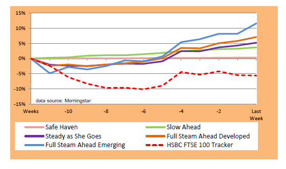
Here’s the group chart. And we can see here that Full Steam Ahead, Emerging Markets (the blue line) – the most volatile group - is clearly performing the best, particularly over the last four weeks:
Now let’s look at the sector numbers, to see whether they confirm the group snapshot or not.
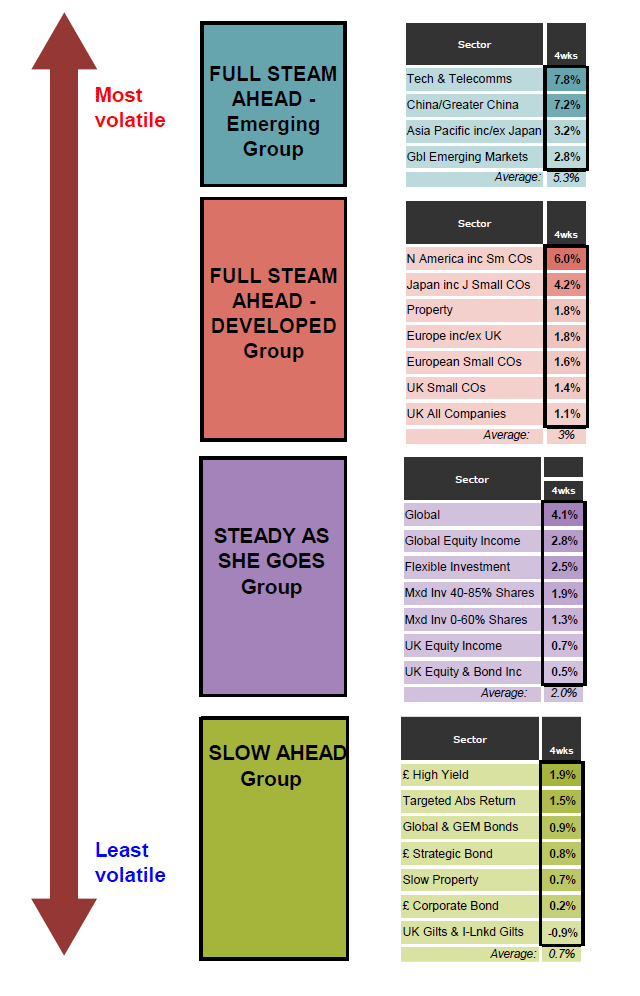
If we look at the Average figure for each group (at the bottom of each column), here you can see that as the volatility of the groups increases, so do the returns. In this example the most volatile group – FSA Emerging - has got by far the best average return.
|
FSA Emerging |
5.3% |
|
FSA Developed |
3.0% |
|
Steady As She Goes |
2.0% |
|
Slow Ahead |
0.7% |
And the same is true of the sectors. The best-performing sector – Tech & Telecomms – is in the most volatile group (FSA Emerging), with a four-week return of 7.8%.
If we go down to the next lower -volatility group, FSA Developed, the best -performing sector here – N America incl Small Companies – has a four-week return of 6%.
In other words, the higher-volatility sector – Tech & Telecomms – is showing significant out-performance relative to the lower volatility sectors. In fact it’s out-performing by 1.8%, which is a big difference over four weeks.
And therefore, in this case, we would want to increase our exposure to the higher-volatility sector, because the much higher performance does justify it.
Two ‘odd’ sectors
Tech & Telecomms, and Property: how they fit into the Saltydog groups
Most of the IA fund sectors fit nicely into the Saltydog groups in a way that is self-evident.
However with two sectors this isn’t true: Tech & Telecomms, and Property.
How do we assign them to the appropriate Saltydog groups? By carefully analysing their volatility. Tech & Telecomms is very volatile, so it fits in with the “Full Steam Ahead, Emerging Markets” group – the most volatile one.
With the Property sector, we’ve taken the official IA sector and sub-divided it into two. (These two ‘sub-sectors’ are our own invention, and not part of the IA scheme). Again this is based on our analysis of the volatility of the funds within it.
“Slow Property” goes in the Slow Ahead group. And “Property” goes in the Full Steam Ahead, Developed Markets group.
Read next > How you identify a worthwhile trend

Comments
0 comments
Please sign in to leave a comment.